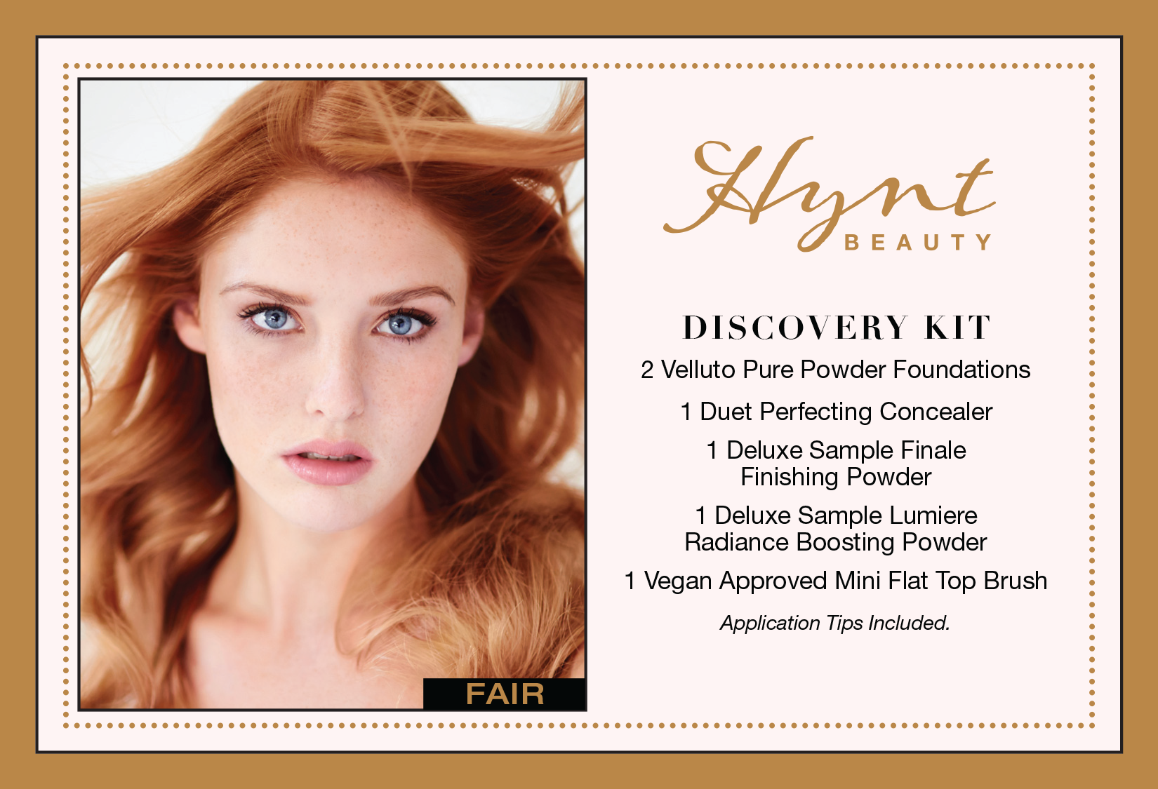
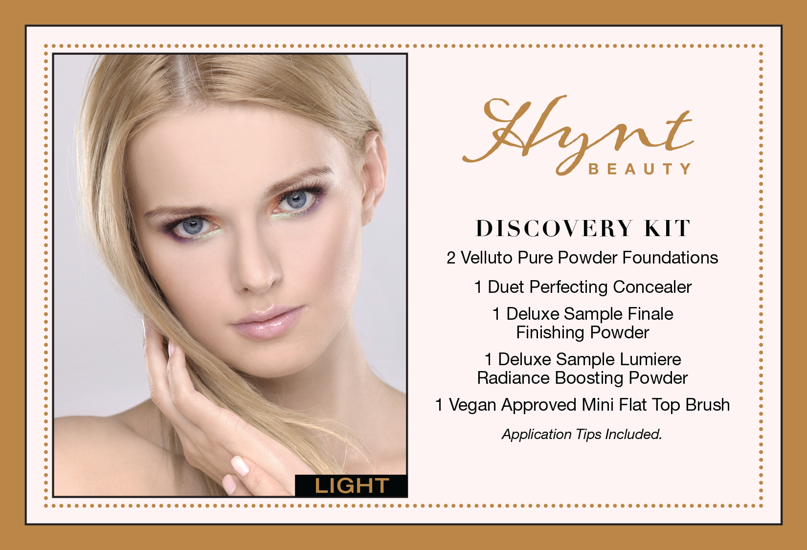
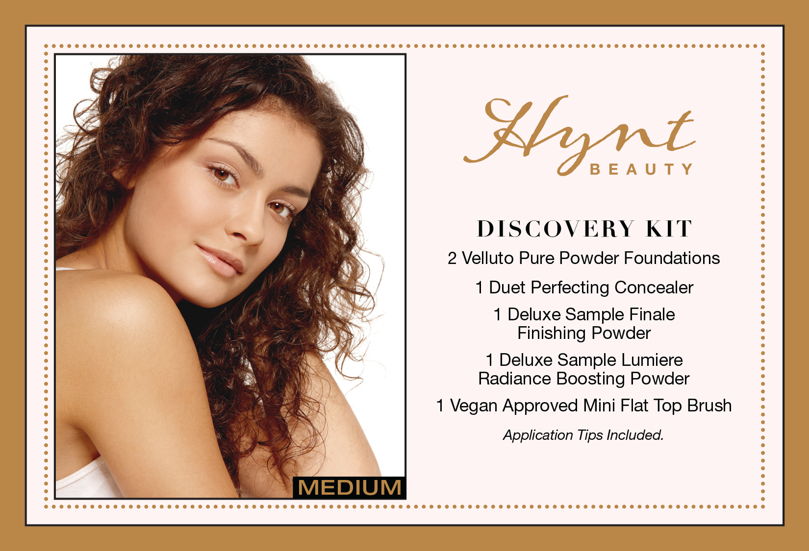
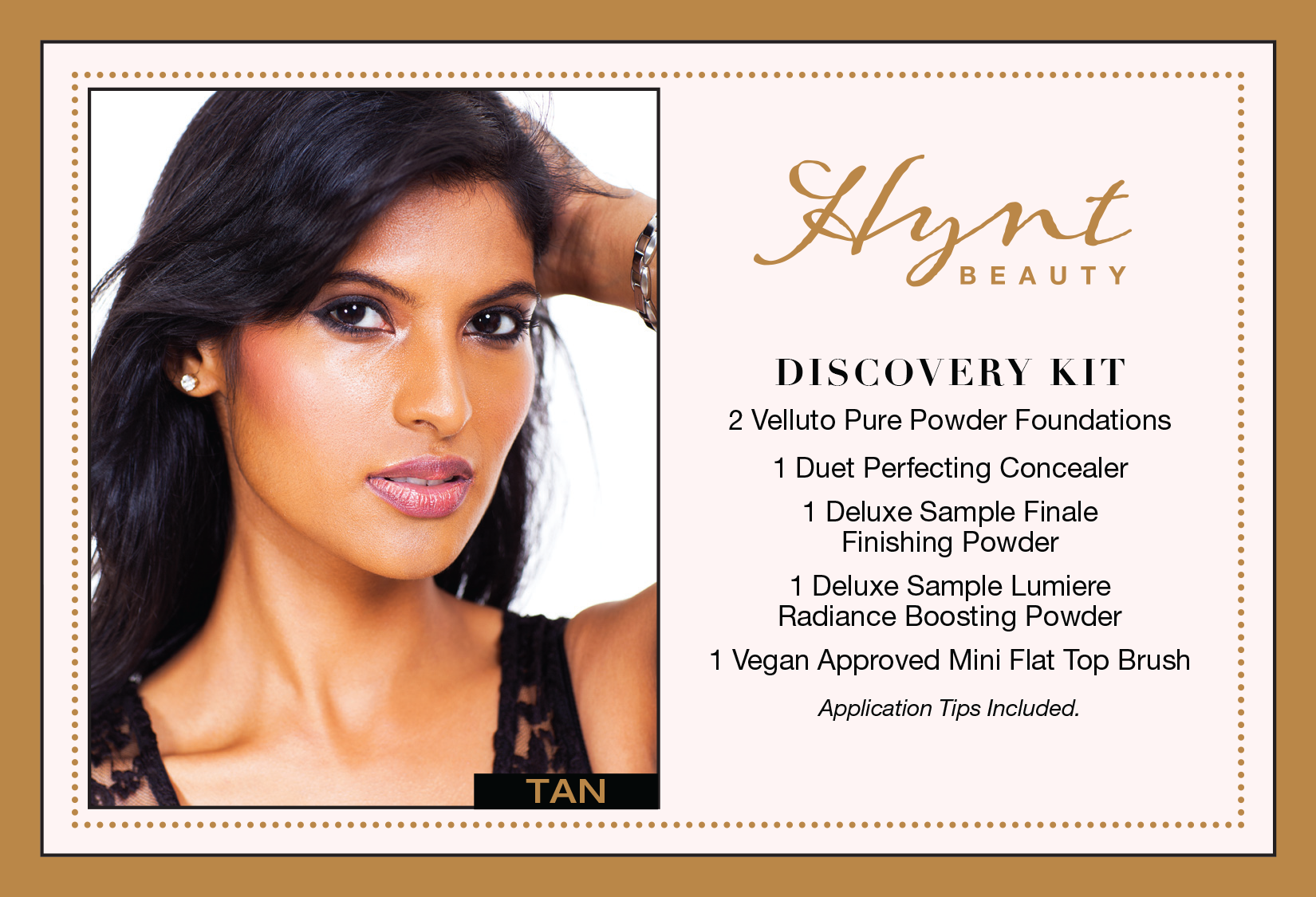
Hynt Beauty
CLICK ON IMAGE TO ENLARGE
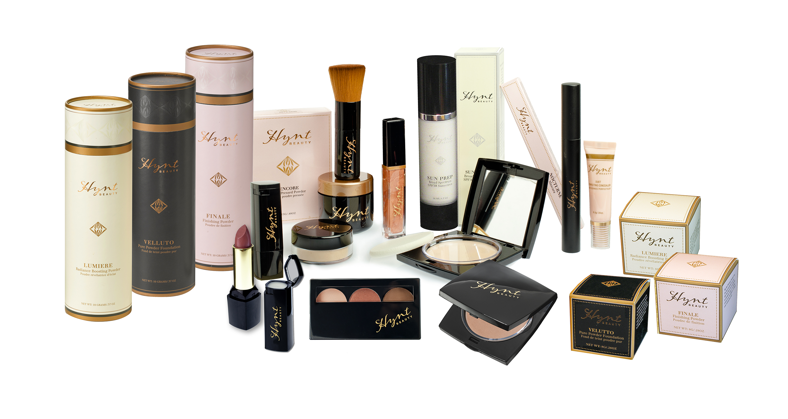
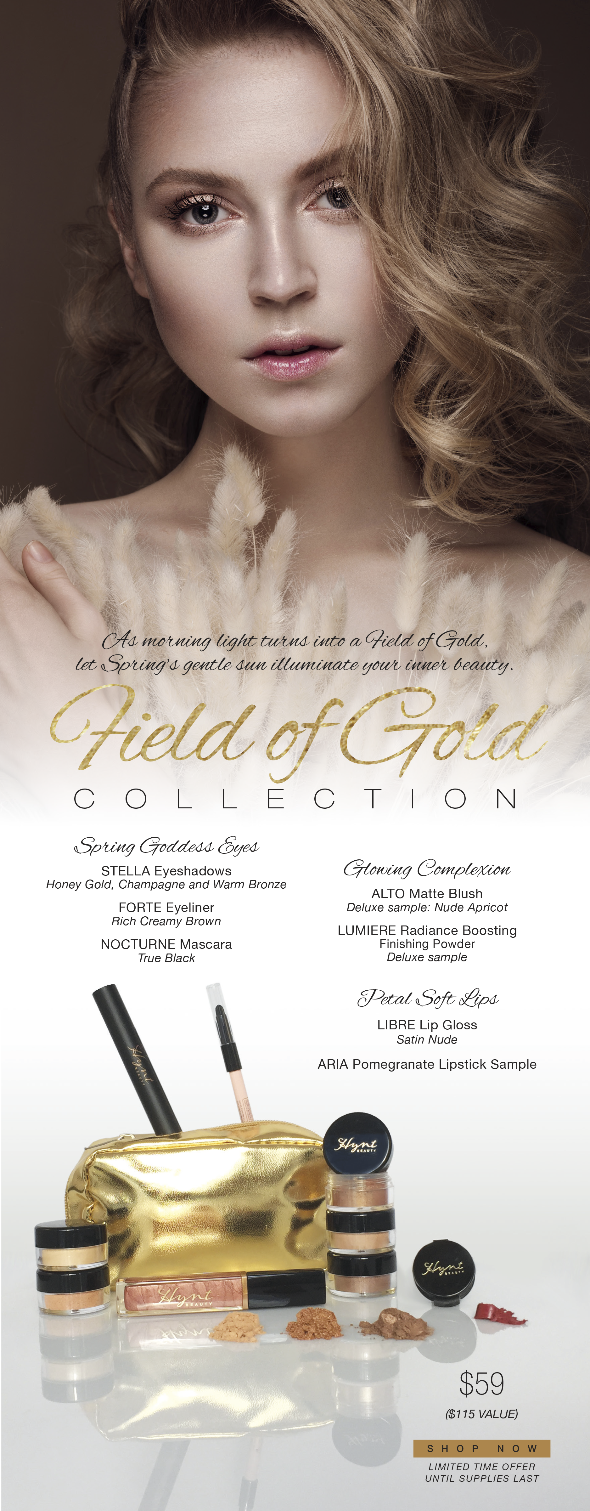
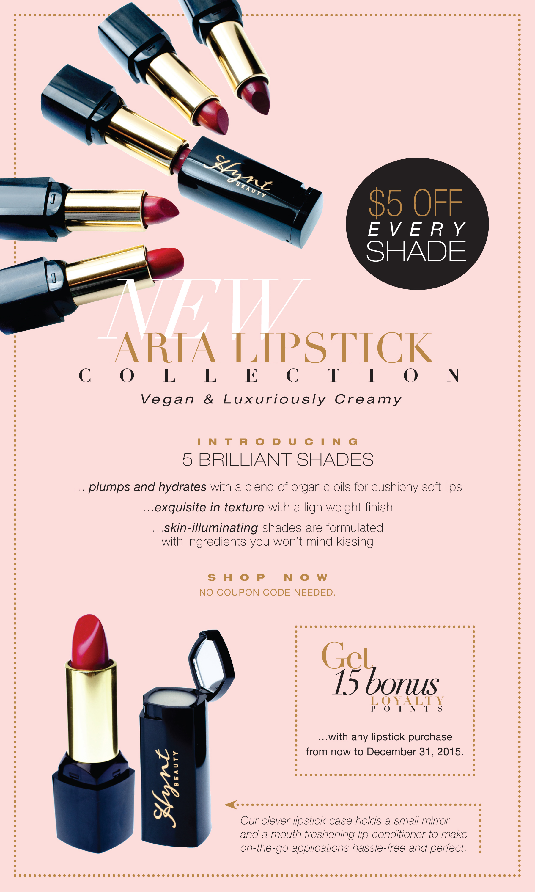
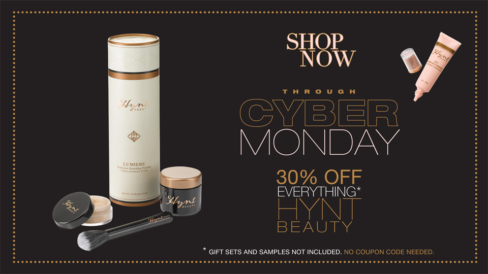
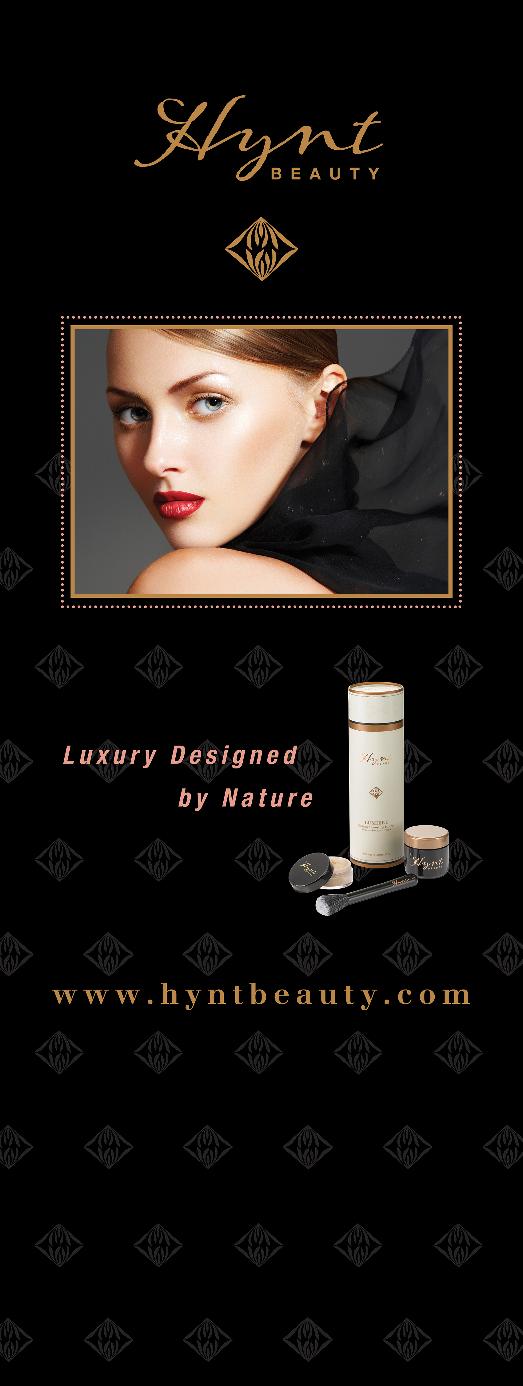
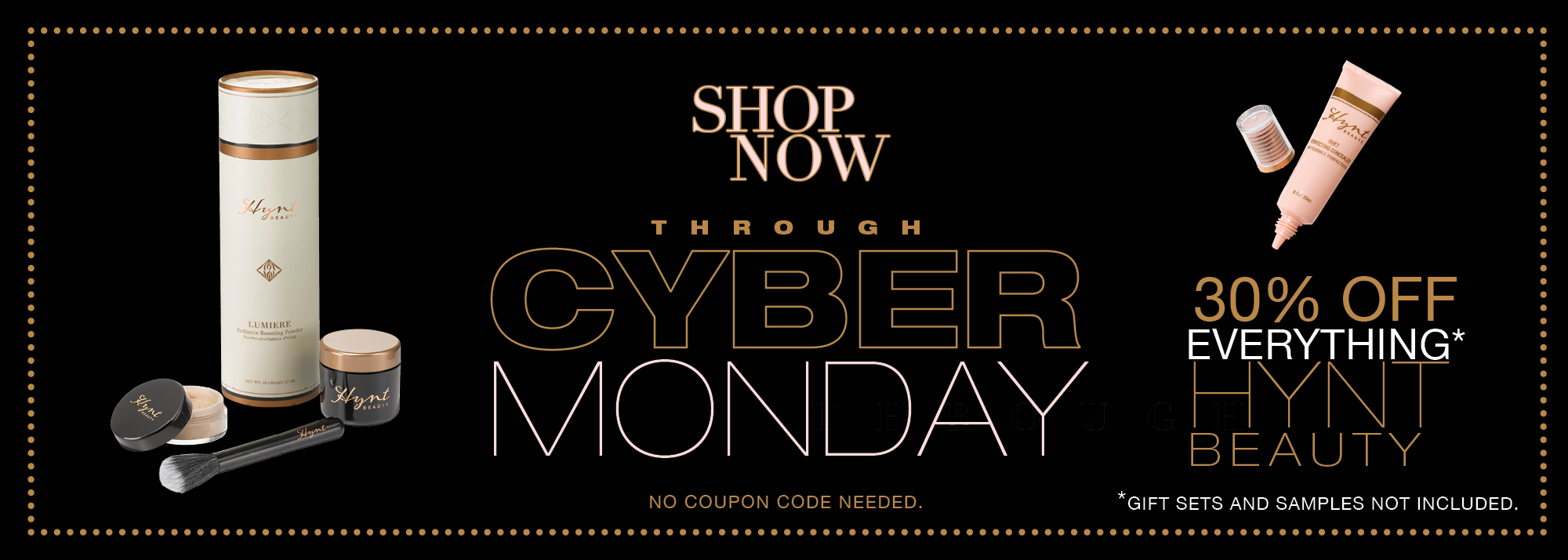
Winter 2014 – Craig and Meryl Marshall approached me for the second time to re-brand their existing product line. Their intention was to refresh their new and expanded line of organic products. Their target release was for the Spring 2015. After a wonderful success rate in the past, once again we collaborated with their new marketing team and set a pace that would supersede more than before. Since natural organic cosmetics is the wave of today, we created a soft and elegant revised color palette of pale coral pink, creamy white, contrasted against dramatic copper metallics with rich black accents. With an international and national audience to appeal to, the product packaging reveals the charming elegance of Europe with a contemporary clean look representing organic botanicals.
During the process, I conceived an icon – the lotus bud, influenced by the origins of Japanese family crests which are ornamental emblems going back to the eleventh century. The application of copper metallics was a visual aesthetic that gave Hynt Beauty's branding an extra special modern twist of style and appeal.
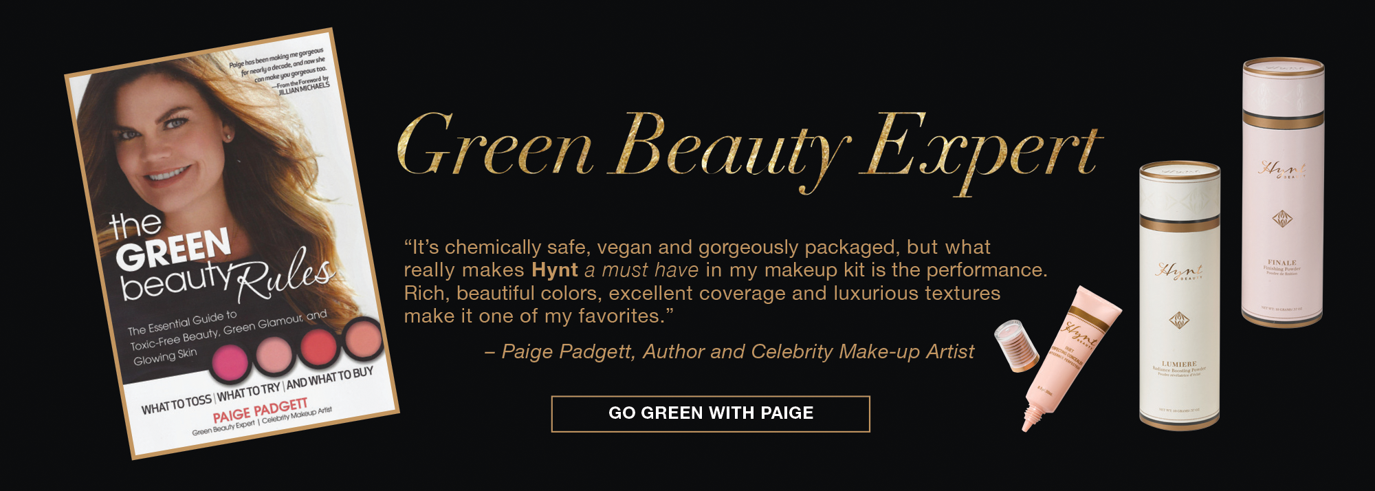
Hynt Beauty’s new identity packaging, brochure, on-line presence including consistent year-round e-blasts have increased sales and marketing with unrelenting success. The Marshalls and their team of experts have welcomed me as their ongoing design consultant team member. With enthusiastic conviction I support Hynt Beauty’s tag line, “Luxury Designed by Nature”.